Catching up on some #cycling #DataVisualisation - withdrawals at the 2023 Women's Tour de France - https://fulltimesportsfan.wordpress.com/2025/04/28/withdrawals-in-the-womens-tour-de-france-2023/
#datavisualisation
1 post1 participant0 posts today
Do you know?
Interactive map with factories and their CO2 emissions.

Replied in thread
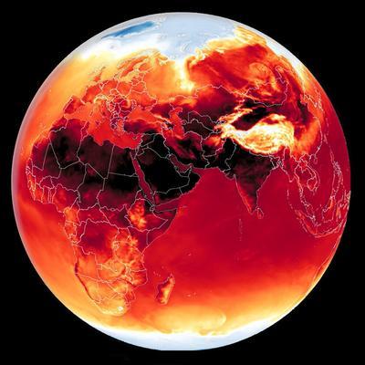
A terrific visualisation of our rising seas!! Also somewhat mesmerising in itself, as an art form, of a dreadful condition & future. And as you say, it “is only going to get harder to ignore.” 
#ClimateCollapse
#RisingSeas
#ClimateChange
#dataVisualisation
#Future
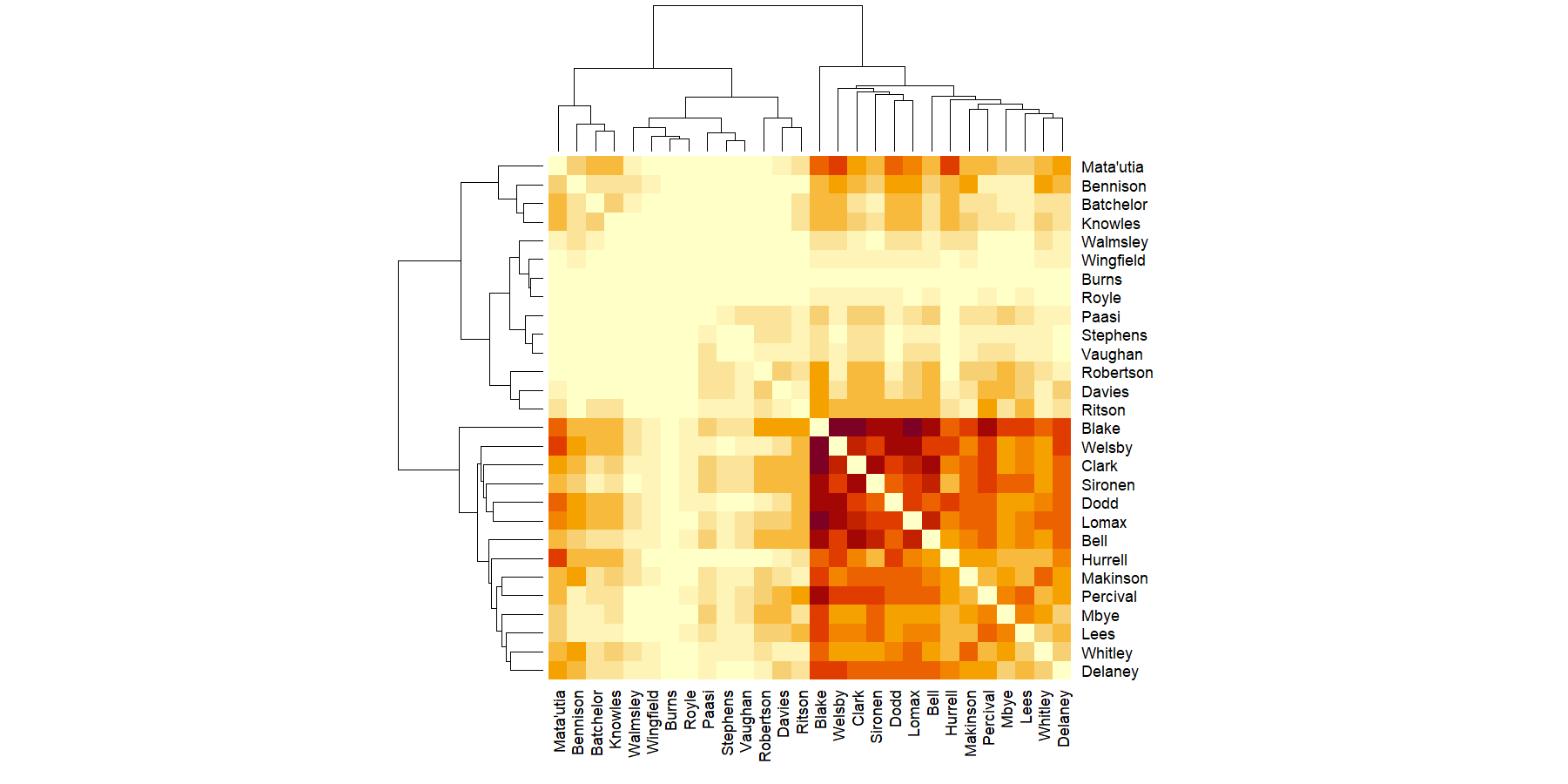
Saints's 23rd game in 2024 was an unnecessarily close match against Salford that Moses Mbye won with a drop goal in golden point extra time. It did some interesting things to the season to date charts - https://fulltimesportsfan.wordpress.com/2025/04/11/saints-ahoy-game-23-and-the-2024-season-to-date/ #RugbyLeague #DataVisualisation #rstats

Is there a way to graph trending hashtags on mastodon/the Fediverse?
What I'm interested in is to graph say my local city of #Adelaide and use that as a bit of an indicator of if #Mastodon usage and engagemement is growing locally in my town
And yes im interested in data across the fediverse or at least across a few selected servers, as I want data beyond just a single instance.
I can see this on my desktop web interface right now.. so Im guessing there *should* be a way.

Everyone knows ggplot2 in R or matplotlib in Python. But what are the differences between theese 2 programming languages and what are the most important R & Python libraries for visualization? 
Towards Data Science · The Essential Guide to R and Python Libraries for Data Visualization

Cartographie de l’IA générative
Par Estampa
La popularisation de l’intelligence artificielle (IA) a donné naissance à des imaginaires qui invitent à l’aliénation et à la mystification. À l’heure où ces technologies semblent se consolider, il est pertinent de cartographier leurs connexions avec les activités humaines et les territoires plus qu’humains. Quel ensemble d’extractions, d’agences et de ressources nous permet de converser en ligne avec un outil de génération de texte ou d’obtenir des images en quelques secondes ?
 https://cartography-of-generative-ai.net/
Via @inthedadabase et @NbYr #IntelligenceArtificiel #DataVisualisation #cartographie

Looking for material for a 2h undergrad lesson:
Is there any data visualistation primer, tutorial, book, blog post, etc, you would suggest?

Une infographie instructive sur les « Limites planétaires » concept essentiel mais souvent présenté de façon complexe, par @jfabreguettes
J’ai donc travaillé à un schéma simplifié pour appréhender clairement le sujet.
A signaler aussi une page (work in progress) pour archiver ses infographies sur l’environnement (toutes à disposition gratuitement en licence CCO domaine public) :
https://www.typographies.fr/N/environnement/environnement.html
Note : synthèse librement inspirée de deux messages publiés sur Mastodon par l’auteur.


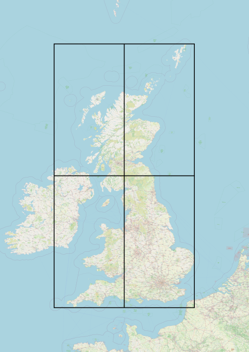
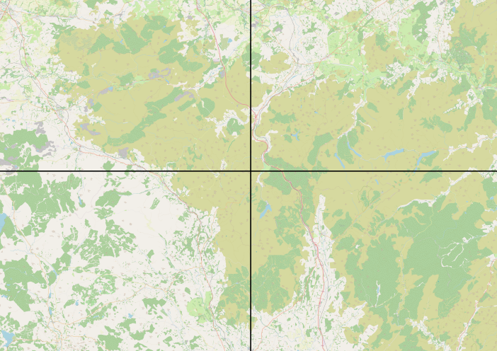
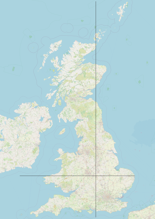
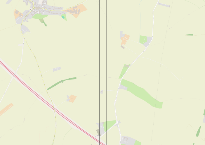
Today I have been dusting off some old code looking at the perennial question of "where is the centre of country x" for a value of x is the UK.
I here are two methods of identifying the centre point, one based on a geographic bounding box centroid for the UK, and a population centroid calculated by slicing the UK into 100m horizontal and vertical rectangles and working out the cumulative centre point using @WorldPopProject data in an EPSG:3034 projection

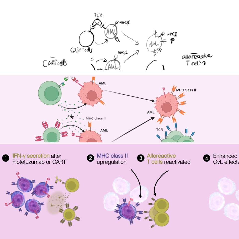
Want to prep a sparkling #GraphicalAbstract?
Our 10-steps are out now!
 distill Message
 add Pictures & Pictograms
  simplest Charts
 lay out Size
 pick Reading Direction
 arrange w/ Arrows
 helpful Text
  beautify with Colors
  tips for Tools
 get Feedback
Feedback? Need help? -> get in touch!
#scicomm #LifeScience #medicalresearch #phdlife #datavisualization #DataViz #datavisualisation
#academicwriting
#UniversitätsklinikumDresden
@tudresden
#FHGR
https://journals.plos.org/ploscompbiol/article?id=10.1371/journal.pcbi.1011789

Hello, new intro as I've moved instances!
I'm a founding Director of the non-profit @thentrythis in Cornwall, where I do #Research #OpenScience #AppropriateTechnology #DataVisualisation #CitizenScience #FreeSoftware #SciComm #PublicEngagement #OpenHardware type of things, usually for #ClimateChange #Ecology and #Environment projects. I'm a happily recovered genetics #Academic.
Will post pics of #Dogs and #Allotment stuff too.

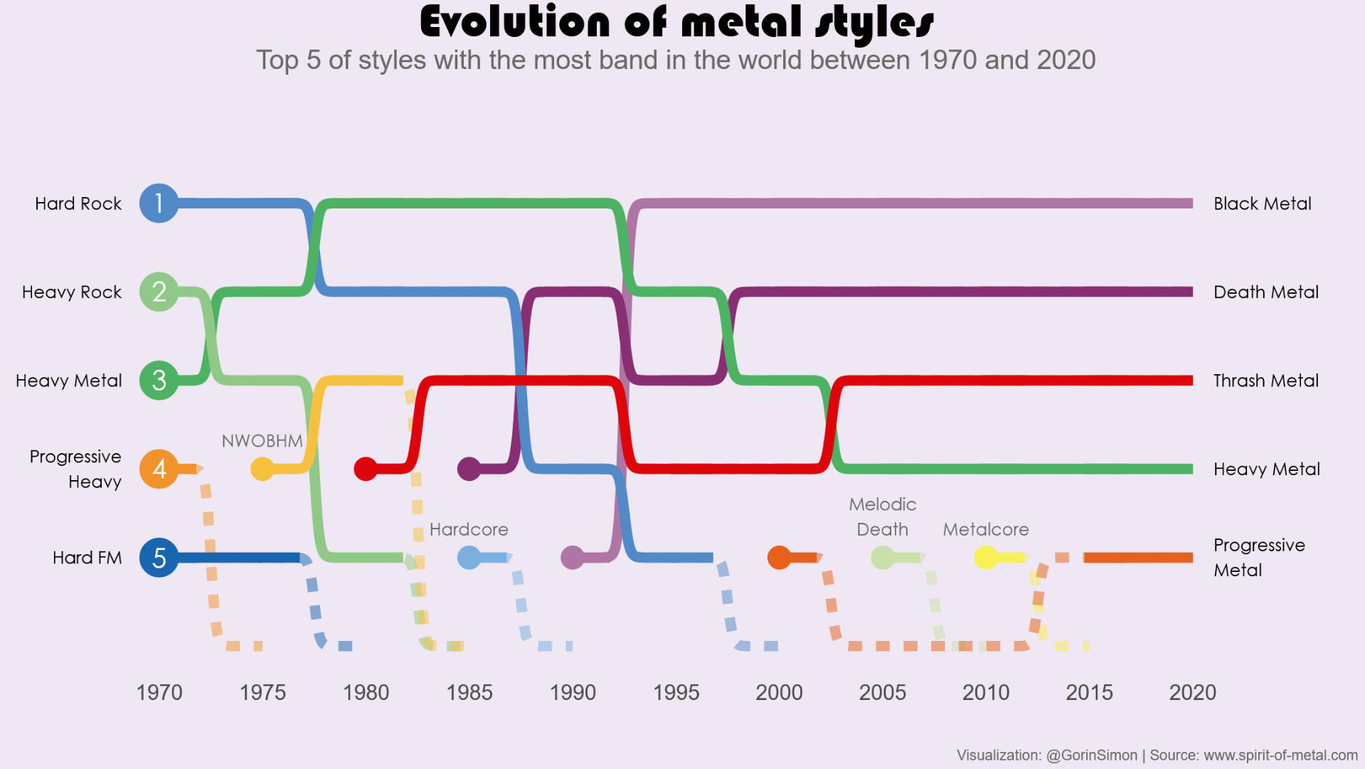
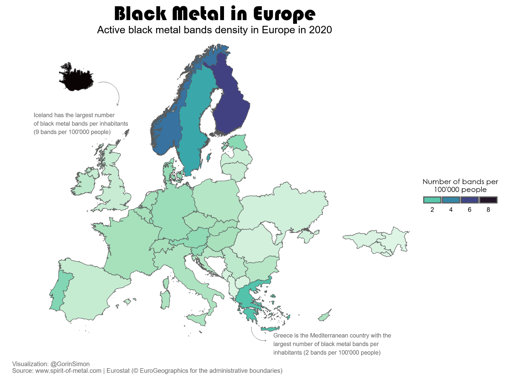
Recently, I worked on exploring new visualization techniques using data about metal bands that I gathered through web scrapping. As it's been a while since I published anything on my website, I wrote an article about it (https://gorinsimon.github.io/posts/metal_viz/metal_viz.html).
That was really fun working on this and I hope you'll find it interesting 
Enjoy reading!
GIF
Hello vis.social, thanks for having me over from the big instance!
I'm a founding Director of the non-profit @thentrythis in Cornwall, where I do #Research #OpenScience #AppropriateTechnology #DataVisualisation #CitizenScience #FreeSoftware #SciComm #PublicEngagement #OpenHardware type of things, usually for #ClimateChange #Ecology and #Environment projects, with #privacy and #ethics taken seriously. I'm a happily recovered genetics #Academic.
Will post pics of #Dogs and #Allotment stuff too.

#introduction I am a data visualisation scientist at Office for National Statistics. Also an artist and keeper of cats. I’m a goth/punk/hippy mash up. #datavis #datavisualisation #twittermigration

Hi there ! #Introduction time
I have been working as a #datajournalist / #visualjournalist for 9 years, working almost exclusively with #rstats. I am based in #Switzerland.
I work for the Swiss French speaking media #LeTemps. I also teach #datajournalism to (non-geek) journalists. Initially trained as a computational biologist, I was a working as a #quant, before switching to #media
I am well versed into the #tidyverse and #rstats, especially #ggplot2 #sf for #datavisualisation & #ddj