I just do not understand why people at work tell me my opinions are too strong
#dataviz
I just do not understand why people at work tell me my opinions are too strong
#dataviz
I've (finally!!) finished porting my website over to Quarto: https://nrennie.rbind.io/
It looks much the same as the previous Hugo site and I've tried to make sure nothing is broken  In an ideal world you won't notice any difference!
(But hopefully it's easier for me to maintain in the background)
Raj's dashboard, updated this morning, shows Stratus XFG overtaken by child XFG.2; PQ.2 as standout child of Nimbus NB.1.8.1 / PQ; and LP.8.1 long ago overshadowed by LP.8.1.1/ NY.
GISAID data for the most recent fortnight is dominated by submissions from New York (with all of 91 sequences), followed by Florida (with 17), Colorado and California (both 16).
#CDC's most recent Friday dataset, updated Tuesday June 24, showed Nimbus taking plurality, with Stratus XFG family also gaining share.
FDA vaccine target LP.8.1, dominant since March, plateaued in April. June saw Nimbus NB.1.8.1 / PQ, scion of "razor-blade throat" XDV, push LP.8.1 out of majority.
❖ #ThisIsOurPolio #variants #CovidIsNotOver #dataviz #datavis
![Chart: Est. U.S. Variant Proportions by Common Name
Sources: CDC, Cov-Lineages, NYITCOM, D. Focosi, WHN, others
[ beadsland on Ko-fi ]
Reskin of CDC's Variants Nowcast, and any significant variants in GISAID not broken out by CDC.
Five bar-style tree-charts, for fortnights through Jun 8–21. Legend of last fortnight, organized by subheadings of color-grouped families and convergent clusters. Percentages overlay each color key, reflecting share as of most recent tree-chart.
Essentially all Omicron-2 BA.2 dynasty. WHO-Vaccine-Target JN.1 family accounts for well over half share; Nimbus NB.1.8.1 / PQ for over two fifths.
For 6/22–7/5, estimates make up for outdated CDC Nowcast, with leading sequences from GISAID. Packed bubble charts fill single-variant tiles.
Legend:
LF.7 + NTD-meets-RBD [browns]:
52% - XFG.2†, XFG.3† & other Stratus XFG
2% - XFC
1% - other LF.7 + NTD-meets-RBD
JN.1.11 + FLiRT31-LP [purple]:
19% - LP.8.1.1 / NY†, NY.3† & other FDA-Vaccine-Target LP.8.1
Omicron-2 BA.2 [green]:
15% - PQ.2† & other Nimbus NB.1.8.1 / PQ
JN.1 + FLiRT-LF-7 [reds]:
⅝% - LF.7.9, LF.7.7.2 & LF.7.7.1 / PV
4% - other LF.7
JN.1.11 [blues]:
⅘% - other KP.3.1.1 / MC
0% - other JN.1.11
Other [greys]:
½% - other XEC
⅝% - other WHO-Vaccine-Target JN.1
0% - Other (not specified)
_____
Nimbus NB.1.8.1 / PQ is a scion of left-field Razor-Blade-Throat XDV.
WHO-Vaccine-Target JN.1 is a grandchild of Winter 2024's Pirola BA.2.86.
[Some footnotes omitted, due to too many recombinants.]](https://spaces.hcommons.social/media_attachments/files/114/925/130/567/838/231/original/43d5f7ccc2154822.jpg)
@francoiscuenot #dataviz cc @Saint_loup & @white_fangs pour vos réseaux
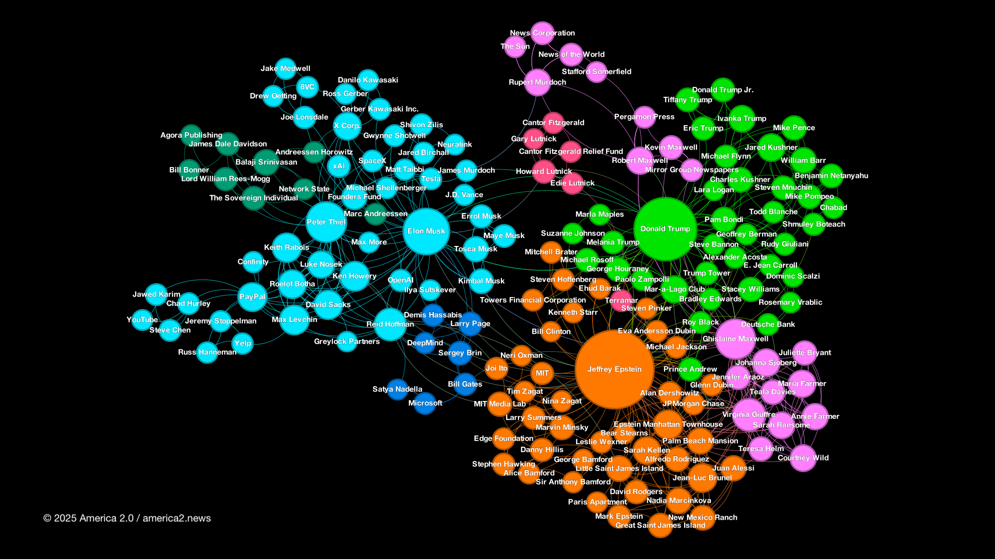
‘We mapped Jeffrey Epstein's social network. Here's what we found.’
https://america2.news/we-mapped-jeffrey-epsteins-social-network-heres-what-we-found/
 PhD in visual analytics + healthcare? Apply to the VAHC 2025 Doctoral Consortium!
 Nov 2, 2025 |
  Vienna, Austria |
  Deadline: Aug 20 (23:59 AoE)
Present your work, get expert feedback, and join a vibrant research community. Info: https://visualanalyticshealthcare.github.io/homepage/2025/docconsortium.html
#VAHC2025 #DoctoralConsortium #PhD #IEEEVIS #MedicalAI #DataViz #HealthInformatics
Where my passions for #cycling and #DataViz collide!
The evolution of the #TourdeFrance
| @datawrapper Blog https://www.datawrapper.de/blog/the-evolution-of-the-tour-de-france

 ¿Querés mejorar cómo contás historias con datos en R?
En Estación R lanzamos un nuevo taller sobre visualización: claro, práctico y con foco en comunicar hallazgos con impacto.
Cronograma: 2, 4 y 9/9 -20% hasta el 28/7 Más info: estacion-r.com/courses
Looking forward to giving a 4-hour workshop on #dataviz at the First Summer School on Linguistic Creativity in Bielefeld tomorrow! #Vorfreude
UPDATE 
That was a lot of fun and we manage to cover a lot in four hours! The slides can be found here (but please note that they are not intended as self-learning materials): https://elenlefoll.quarto.pub/2025-bielefeld-dataviz and the practical #ggplot2 part was based on Chapter 10 of my in-progress textbook: https://elenlefoll.github.io/RstatsTextbook/10_Dataviz.html.

How NOT to Lie with Charts - by Enrico Bertini - FILWD https://filwd.substack.com/p/how-not-to-lie-with-charts — 10 Rules for Truthful #DataViz

Interesting.
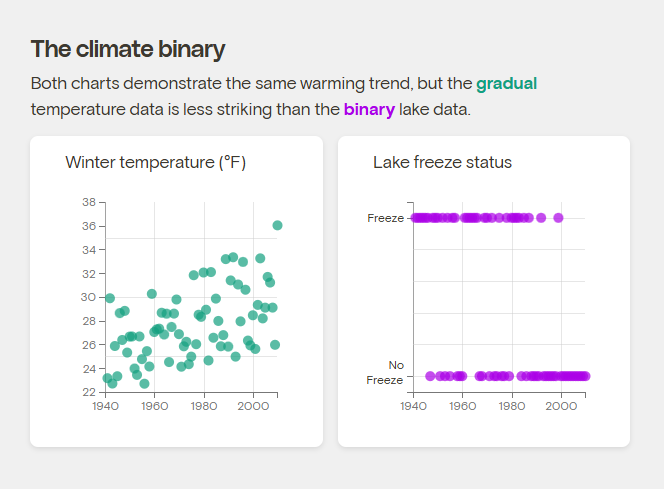
"Liu worked with professors at Princeton to test how people responded to two different graphs. One showed winter temperatures of a fictional town gradually rising over time, while the other presented the same warming trend in a black-or-white manner: The lake either froze in any given year, or it didn’t. People who saw the second chart perceived climate change as causing more abrupt changes."
https://grist.org/science/break-through-climate-apathy-data-visualization-lake-freezing-study/
New server, new #introduction:
 Hi! I'm Eric! I'm a scientific programmer & educator who writes mostly
  code. I currently work part time at #UniversityOfArizona where I help researchers by making R packages, #Shiny apps, automated data workflows, and training them on #ReproducibleResearch practices. I also mentor data scientists for @Posit Academy. I am #OpenToWork as a contractor if any of those skills sound useful to you.
My background is in plant chemical ecology and population ecology and for my PhD I studied #tea and did field work in China. I love tea (although I've been drinking coffee more and more lately) and practice #GongFuCha when I can. I love #foraging and tasting new things.
I currently live in #Tucson by the #BayArea will always be my home.
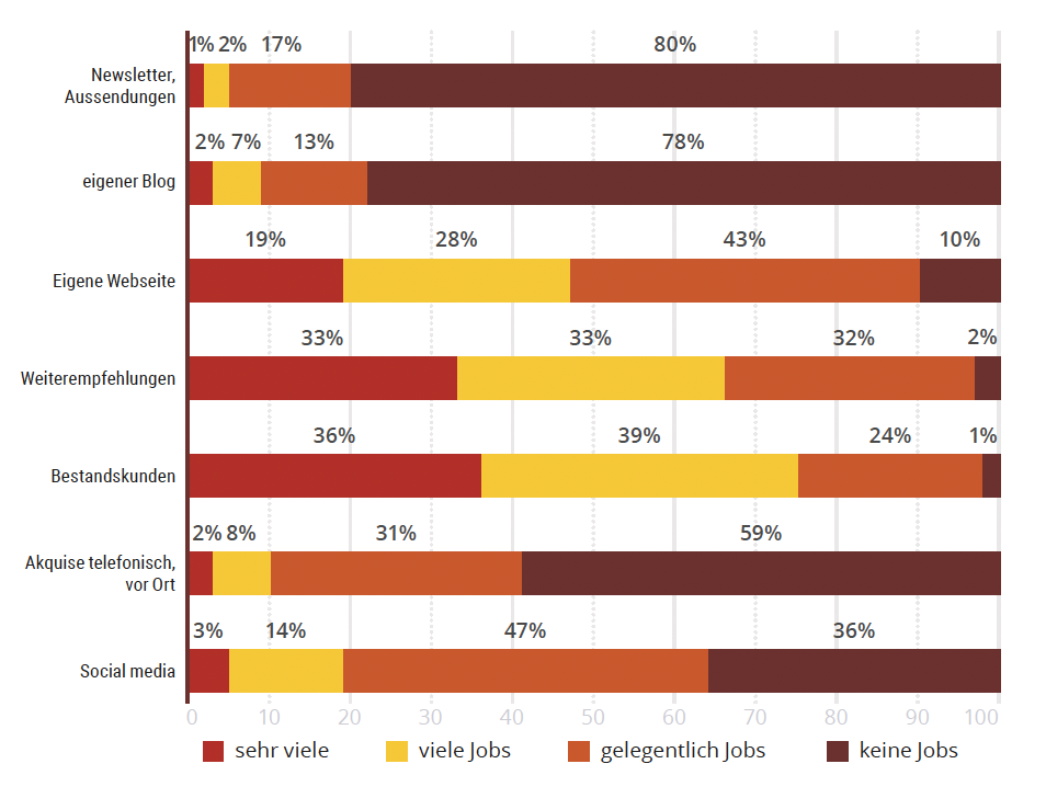
The German Association of Professional Photographers has asked its members some interesting questions, including which channels they use to get new orders.
However, the order situation is tight in many places. Only 1% of respondents complained about too many jobs in 2024; only 7% were working at full capacity. 35% stated that they had too few or no orders.
Source and more results of the survey: https://www.profifoto.de/szene/business/2025/07/21/professionelle-fotografie-2025
Datavzrd is a new tool for interactive visualization of tabular data that takes output specifications in YAML format and produces portable output that does not require a server process.
Summary: https://techxplore.com/news/2025-07-source-tool-complex.html
Original paper: https://journals.plos.org/plosone/article?id=10.1371/journal.pone.0323079
Last week, I crafted my first-ever gauge chart  to showcase partial radial plots for our #ggplot2 [un]charted lesson on "coordinate systems".
Thanks to coord_radial(), partial circles like those are super easy now — and of course I couldn’t resist making a polished and animated version 

Speaking with customers over the last year, I have been fascinated by the failed promise of self-serve analytics. High expectations made this a priority for companies large and small looking to drive efficiencies and a competitive advantage from the democratization of data.
In this blog post, I will explain the challenges, including real world examples, and offer an alternative solution that actually works.
#dataviz #datavisualization @observablehq
https://observablehq.com/blog/the-failure-of-self-serve-analytics
June 2025 data is now available for both Antarctic sea-ice thickness/volume (https://zacklabe.com/antarctic-sea-ice-extentconcentration/) and global sea-ice volume (https://zacklabe.com/global-sea-ice-extent-conc/) from GIOMAS.
Last month's global sea-ice volume has fallen to near-record low levels for the month of June in this dataset.
Statistical Graphics and Comics: Parallel Histories of Visual Storytelling | Nightingale https://nightingaledvs.com/statistical-graphics-and-comics/ #DataViz
Executives are flooded with dashboards, graphs, and updates. What they need, however, is clarity—not more data. Senior leaders want to quickly understand what’s happening, why it matters, and what decisions need to be made next.
https://www.europeanbusinessreview.com/beyond-data-turning-insights-into-boardroom-ready-narratives/